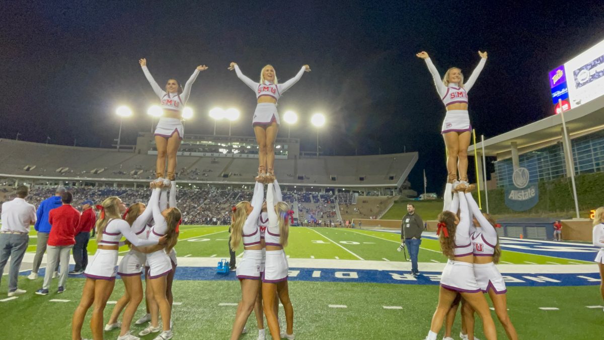


This glorious thing called football is back. As you’re glued to your television or watching in the stands, you can’t help but notice some teams have awesome logos, but also other teams have awful logos that make you want to switch your TV to “Honey Boo Boo.”The American Athletic Conference is no exception.
As you watch SMU football this season, you’ll wonder what exactly that thing is on Navy’s helmets and laugh at Cincinnati’s cheap-looking logo. To save you some trouble, I ranked the AAC teams’ logos from worst to best.
(All pictures are courtesy of Chris Creamer’s Sportslogos.net)
12. Houston Cougars

*Yawns*
11. Cincinnati Bearcats

A red line and a “C” with four claws simply thrown on top of it? Lame. But the bigger question is, what’s a Bearcat???
10. Tulsa Golden Hurricane

You could really do something cool with the name “Golden Hurricane.” But two red flags is underwhelming. I see what Tulsa tried to do: two red flags with the black square is a hurricane warning sign. But this seems like massive overthinking. Most non-coastal residents won’t even know what the two red flags mean. Last time I checked, the city of Tulsa isn’t close to a coast or hurricane territory.
9. Tulane Green Wave

Including “wave” in a team name and logo when that team plays in a city below sea-level just doesn’t sound like a great idea.
8. Central Florida Knights

It’s an original logo, but knights are from Medieval Europe. Medieval Europe and college sports are completely unrelated.
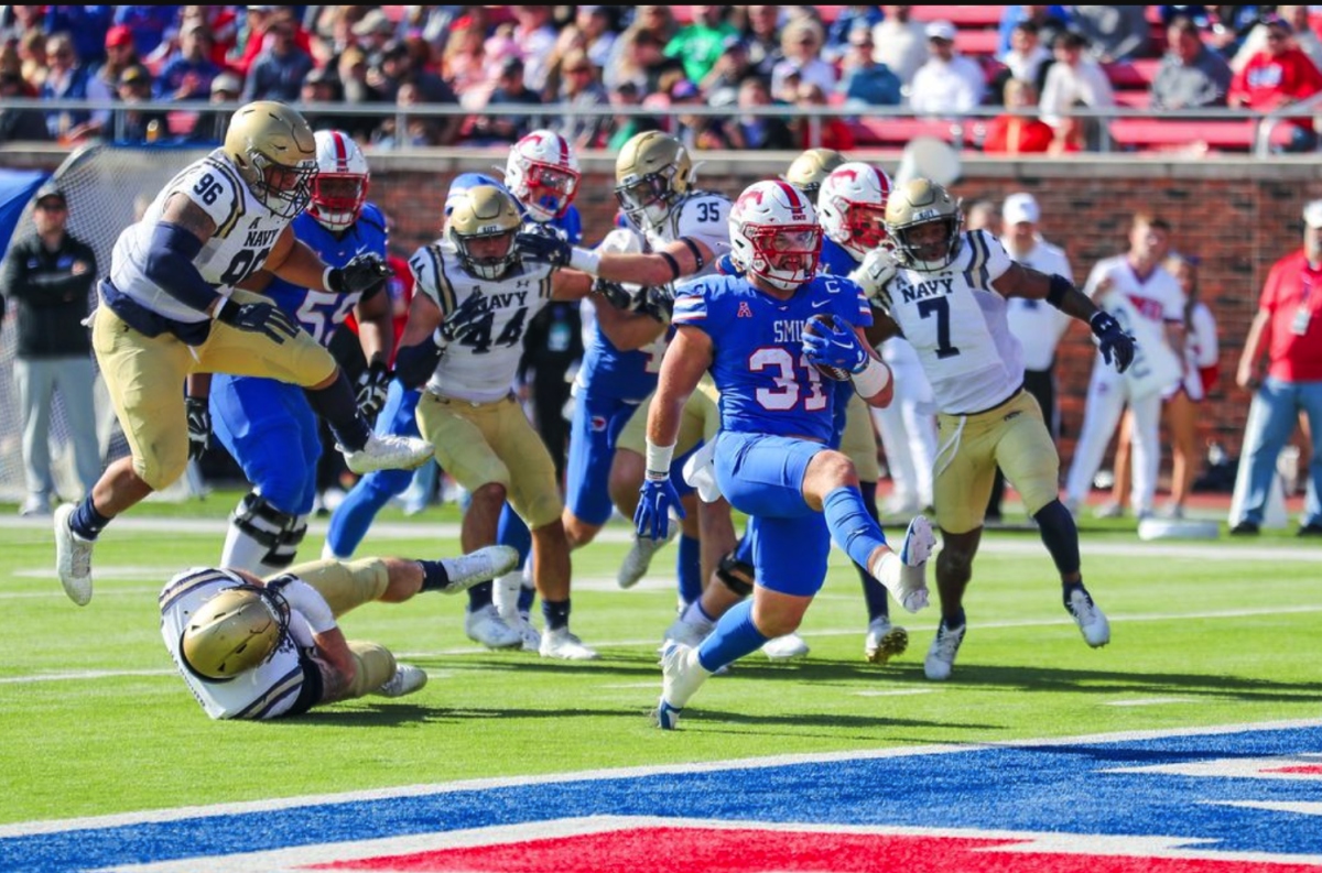
7. Navy Midshipmen

Something cool: That’s an awesome animal.
Something not as cool: We don’t really know what kind of animal it is.
Something very un-cool: That animal doesn’t belong on a ship.
6. South Florida Bulls

Florida college teams have some strange obsession with basing their logos around the letter “U.” But unlike Miami’s, South Florida’s “U”-based logo is a little more complex and doesn’t look like a hockey stick next to a backwards hockey stick. It may look like just a “U” with horns, but the “U” bows in a little bit to make it look like a Bull’s head. That’s how you make a letter that’s not your primary letter into a cool logo.
5. Temple Owls

Lots of teams with bird logos make them unnecessarily mean looking. For example, Cardinals are supposed to be graceful birds. Nothing about the Louisville or Arizona Cardinals’ logo looks graceful. Owls are supposed to be a little angry and loud. Props to Temple for getting the general emotion of an owl right and making this one look like it’s screeching (probably because some ill-mannered Philadelphian threw a rock at it).
4. Memphis Tigers

This might be the most detailed tiger logo for any team with the Tigers nickname. It has the tail, sharp eyes, full body, outstretched arms and all. It looks fierce, but don’t worry, the tiger is trying to eat Josh Pastner, not you.
3. Connecticut Huskies

Who doesn’t like dogs? This is hands down the freshest logo for any team nicknamed the Huskies.
2. Southern Methodist Mustangs

Who else can say that their logo inspired a famous car? (Peruna actually did come before the car.) And it’s not copyright infringement because Peruna runs right while the Ford Mustang runs left. If it was copyright infringement, it would get dead last. If it secretly is copyright infringement and no one knows about it, it looks like SMU finally figured out how to cheat and get away with it. Yay!
1. East Carolina Pirates

A picture of Edward Teach is a pretty awesome way to scare your opponent. With the earring, tri-cornered hat and eyepatch, this is my favorite of the AAC logos.